It's Not How Good You Are, It's How Good You Want to Be: The world's best selling book  Paul Arden began his career in advertising at the age of 16. For 14 years he was Executive Creative Director at Saatchi and Saatchi, where he was responsible for some of Britain's best known campaigns including British Airways, Silk Cut, Anchor Butter, InterCity and Fuji. His famous slogans include 'The Car in front is a Toyota' and 'The Independent - It is - Are You?'. In 1993 he set up the London-based production company Arden Sutherland-Dodd where he is now a commercials director for clients such as BT, BMW, Ford, Nestle and Levis. Graphic Artists Guild Handbook: Pricing & Ethical Guidelines  Overview: A New Perspective of Earth  Ways of Seeing  How to Use Graphic Design to Sell Things, Explain Things, Make Things Look Better, Make People Laugh, Make People Cry, and (Every Once in a While) Change the World  Protégé of design legend Massimo Vignelli and partner in the New York office of the international design firm Pentagram, Michael Bierut has had one of the most varied and successful careers of any living graphic designer, serving a broad spectrum of clients as diverse as Saks Fifth Avenue, Harley-Davidson, the Atlantic Monthly, the William Jefferson Clinton Foundation, Billboard, Princeton University, the New York Jets, the Brooklyn Academy of Music, and the Morgan Library. How to, Bierut’s first career retrospective, is a landmark work in the field. Featuring more than thirty-five of his projects, it reveals his philosophy of graphic design—how to use it to sell things, explain things, make things look better, make people laugh, make people cry, and (every once in a while) change the world. Specially chosen to illustrate the breadth and reach of graphic design today, each entry demonstrates Bierut’s eclectic approach. In his entertaining voice, the artist walks us through each from start to finish, mixing historic images, preliminary drawings (including full-size reproductions of the notebooks he has maintained for more than thirty-five years), working models and rejected alternatives, as well as the finished work. Throughout, he provides insights into the creative process, his working life, his relationship with clients, and the struggles that any design professional faces in bringing innovative ideas to the world. Offering insight and inspiration for artists, designers, students, and anyone interested in how words, images, and ideas can be put together, How to provides insight to the design process of one of this century’s most renowned creative minds. FLEXIBLE TYPESETTING  Editorial Design: Digital and Print 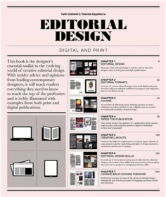 Generously illustrated, including case studies, practical exercises and tips, and examples of best practice; profiles of individual designers include Mark Porter, Scott Dadich, and Janet Froelich. The book explains the fundamentals of editorial design and layout. Subjects covered include current and emerging digital formats, branding, how to create layouts, handling copy and images, design and production skills, and trends in editorial design. With insider advice and opinions from leading contemporary designers, the book is a practical reference and learning resource that will teach readers everything they need to know to reach the top of the profession. The new edition of this book shows how editorial design has adapted to the online and digital world. Calm Technology:: Principles and Patterns for Non-Intrusive Design  Art Direction for the Web  Based on Andy Clarke’s twenty years’ experience of working with clients, plus the expertise of the art directors and designers he interviewed, this eBook is about why art direction matters and how to art-direct compelling and effective experiences across devices and platforms. Andy explores the work of some of the most influential art directors, luminaries like Alexey Brodovitch, Bea Feitler, and Neville Brody. He doesn’t encourage us to merely mimic work from a previous era and medium, but to understand their thinking and learn how to apply that knowledge to art direction for the web. Art Direction for the Web will help you make your sites more effective at communicating, persuading, and selling. Table of Contents What art direction means One hundred years of art direction Art-directing experiences Art direction and creative teams Principles of design Directing grids Directing type Directing pictures Developing layouts with CSS Grid Developing components with Flexbox Developing typography Developing with images Flash Web Design  Visual Journalism: Infographics from the World's Best Newsrooms and Designers  Hooked: How to Build Habit-Forming Products  Why do some products capture widespread attention while others flop? What makes us engage with certain products out of sheer habit? Is there a pattern underlying how technologies hook us? Nir Eyal answers these questions (and many more) by explaining the Hook Model—a four-step process embedded into the products of many successful companies to subtly encourage customer behavior. Through consecutive “hook cycles,” these products reach their ultimate goal of bringing users back again and again without depending on costly advertising or aggressive messaging. Hooked is based on Eyal’s years of research, consulting, and practical experience. He wrote the book he wished had been available to him as a start-up founder—not abstract theory, but a how-to guide for building better products. Hooked is written for product managers, designers, marketers, start-up founders, and anyone who seeks to understand how products influence our behavior. Eyal provides readers with: • Practical insights to create user habits that stick. • Actionable steps for building products people love. • Fascinating examples from the iPhone to Twitter, Pinterest to the Bible App, and many other habit-forming products. Designing News: Changing the World of Editorial Design and Information Graphics 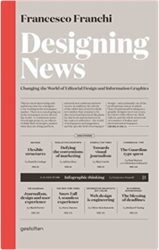 Ando 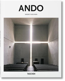 Philippe Starck describes him as a “mystic in a country which is no longer mystic.” Karl Lagerfeld regards him as a 21st-century genius who “saw everything, learned everything, then forgot everything and remade everything.” For the Pritzker Prize jury, “originality is his medium.” In this essential TASCHEN introduction to Tadao Ando we explore the hybrid of tradition, modernism, and function that allows his buildings to enchant architects, designers, fashion designers, and beyond. Through key projects including private homes, churches, museums, apartment complexes, and cultural spaces, we explore a uniquely monumental yet comforting aesthetic that draws as much on the calm restraint of Japanese tradition as the compelling modernist vocabularies of Bauhaus and Le Corbusier. With featured projects in Japan, France, Italy, Spain, and the United States, we see not only Ando’s global reach but also his refined sensitivity for the environs: the play of light through windows, and, in particular, the interaction of buildings with water. From the mesmerizing Church of the Light in Osaka to the luminous Punta della Dogana Contemporary Art Center in Venice, this is a radiant tour through a distinctly contemporary form as much as a timeless appeal of light, elements, and equilibrium. About the series: Each book in TASCHEN’s Basic Architecture series features:an introduction to the life and work of the architectthe major works in chronological orderinformation about the clients, architectural preconditions as well as construction problems and resolutionsa list of all the selected works and a map indicating the locations of the best and most famous buildingsapproximately 120 illustrations (photographs, sketches, drafts and plans) Newspaper Design: Editorial Design from the World's Best Newsrooms 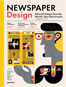 Over recent years, the world of news making has dramatically changed. Newspaper Design examines the forces that have transformed the industry and showcases the best of editorial design in the news context. Following the shift to digital, the role of visual journalists has evolved. As our reading habits change, so do the ways in which designers deal with typography, grid systems and illustration in order to tell a story in the most engaging way. Newspaper Design discusses the daily challenges of journalists and editorial designers, and introduces the work of the teams behind some of the most influential newspapers, such as the New York Times, the Guardian, and Libération. Unique insights from professionals paired with outstanding visual examples reveal the inner workings of the news industry and make Newspaper Design a must-have for designers, publishers and journalists. Javier Errea is the director of Errea Communications, president of the Spanish chapter of the Society for News Design, and coordinator for the Malofiej World Summit and International Infographics Awards. Conversational Design 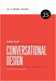 Made to Stick: Why Some Ideas Take Hold and Others Come Unstuck  Creative Confidence: Unleashing the Creative Potential within Us All  Sprint: How to Solve Big Problems and Test New Ideas in Just Five Days  WALL STREET JOURNAL BESTSELLER “Sprint offers a transformative formula for testing ideas that works whether you’re at a startup or a large organization. Within five days, you’ll move from idea to prototype to decision, saving you and your team countless hours and countless dollars. A must read for entrepreneurs of all stripes.” —Eric Ries, author of The Lean Startup From three partners at Google Ventures, a unique five-day process for solving tough problems, proven at more than a hundred companies. Entrepreneurs and leaders face big questions every day: What’s the most important place to focus your effort, and how do you start? What will your idea look like in real life? How many meetings and discussions does it take before you can be sure you have the right solution? Now there’s a surefire way to answer these important questions: the sprint. Designer Jake Knapp created the five-day process at Google, where sprints were used on everything from Google Search to Google X. He joined Braden Kowitz and John Zeratsky at Google Ventures, and together they have completed more than a hundred sprints with companies in mobile, e-commerce, healthcare, finance, and more. A practical guide to answering critical business questions, Sprint is a book for teams of any size, from small startups to Fortune 100s, from teachers to nonprofits. It’s for anyone with a big opportunity, problem, or idea who needs to get answers today. Creative Selection: Inside Apple's Design Process During the Golden Age of Steve Jobs [Paperback] Ken Kocienda  Super Graphic: A Visual Guide to the Comic Book Universe  So You Want to Publish a Magazine? 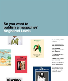 It also acts as an inspirational resource, with case studies from magazines across the sector – from the most niche indie titles, through the main players of the independent scene, to the most innovative and successful larger scale publications. How many people do you need? Do you want to take advertising? Should you hire a distributor or focus on subscriptions? Interviews with industry insiders – editors, art directors, printers, distributors, retailers and more – are filled with expert tips and examples so you can make the right plan for every aspect of your publishing project. Both print and digital magazines are represented, with a focus on navigating the pitfalls associated with transitioning a print title to digital platforms (and vice versa), mastering social media and creating content specifically for digital readers. Design Is Storytelling 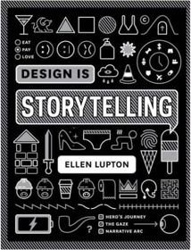 Good design, like good storytelling, brings ideas to life. The latest book from award-winning writer Ellen Lupton is a playbook for creative thinking, showing designers how to use storytelling techniques to create satisfying graphics, products, services and experiences. Whether crafting a digital app or a data-rich publication, designers invite people to enter a scene and explore what’s there. An intriguing logo, page layout or retail space uses line, shape and form to lead users on dynamic journeys. Design Is Storytelling explores the psychology of visual perception from a narrative point of view. Presenting dozens of tools and concepts in a lively, visual manner, this book will help any designer amplify the narrative power of their work. Use this book to stir emotions, build empathy, articulate values and convey action; to construct narrative arcs and create paths through space; integrate form and language; evaluate a project’s storytelling power; and to write and deliver strong narratives. Thinking with Type, 2nd revised and expanded edition: A Critical Guide for Designers, Writers, Editors, & Students  The Laws of Simplicity  Finally, we are learning that simplicity equals sanity. We're rebelling against technology that's too complicated, DVD players with too many menus, and software accompanied by 75-megabyte "read me" manuals. The iPod's clean gadgetry has made simplicity hip. But sometimes we find ourselves caught up in the simplicity paradox: we want something that's simple and easy to use, but also does all the complex things we might ever want it to do. In The Laws of Simplicity, John Maeda offers ten laws for balancing simplicity and complexity in business, technology, and design―guidelines for needing less and actually getting more. Maeda―a professor in MIT's Media Lab and a world-renowned graphic designer―explores the question of how we can redefine the notion of "improved" so that it doesn't always mean something more, something added on. Maeda's first law of simplicity is "Reduce." It's not necessarily beneficial to add technology features just because we can. And the features that we do have must be organized (Law 2) in a sensible hierarchy so users aren't distracted by features and functions they don't need. But simplicity is not less just for the sake of less. Skip ahead to Law 9: "Failure: Accept the fact that some things can never be made simple." Maeda's concise guide to simplicity in the digital age shows us how this idea can be a cornerstone of organizations and their products―how it can drive both business and technology. We can learn to simplify without sacrificing comfort and meaning, and we can achieve the balance described in Law 10. This law, which Maeda calls "The One," tells us: "Simplicity is about subtracting the obvious, and adding the meaningful." Elvis  Understanding Comics: The Invisible Art  "You must read this book." — Neil Gaiman Praised throughout the cartoon industry by such luminaries as Art Spiegelman, Matt Groening, and Will Eisner, Scott McCloud's Understanding Comics is a seminal examination of comics art: its rich history, surprising technical components, and major cultural significance. Explore the secret world between the panels, through the lines, and within the hidden symbols of a powerful but misunderstood art form. Thinkertoys: A Handbook of Creative-Thinking Techniques  In hindsight, every great idea seems obvious. But how can you be the person who comes up with those ideas? In this revised and expanded edition of his groundbreaking Thinkertoys, creativity expert Michael Michalko reveals life-changing tools that will help you think like a genius. From the linear to the intuitive, this comprehensive handbook details ingenious creative-thinking techniques for approaching problems in unconventional ways. Through fun and thought-provoking exercises, you’ll learn how to create original ideas that will improve your personal life and your business life. Michalko’s techniques show you how to look at the same information as everyone else and see something different. With hundreds of hints, tricks, tips, tales, and puzzles, Thinkertoys will open your mind to a world of innovative solutions to everyday and not-so-everyday problems. You’re My Favorite Client  Design As Art  Emotional Design: Why We Love (or Hate) Everyday Things 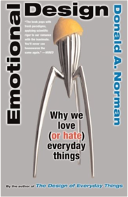 Emotions are inseparable from how we humans think, choose, and act. In Emotional Design, cognitive scientist Don Norman shows how the principles of human psychology apply to the invention and design of new technologies and products. In The Design of Everyday Things, Norman made the definitive case for human-centered design, showing that good design demanded that the user's must take precedence over a designer's aesthetic if anything, from light switches to airplanes, was going to work as the user needed. In this book, he takes his thinking several steps farther, showing that successful design must incorporate not just what users need, but must address our minds by attending to our visceral reactions, to our behavioral choices, and to the stories we want the things in our lives to tell others about ourselves. Good human-centered design isn't just about making effective tools that are straightforward to use; it's about making affective tools that mesh well with our emotions and help us express our identities and support our social lives. From roller coasters to robots, sports cars to smart phones, attractive things work better. Whether designer or consumer, user or inventor, this book is the definitive guide to making Norman's insights work for you. About Face 3: The Essentials of Interaction Design  Making and Breaking the Grid, Second Edition, Updated and Expanded: A Graphic Design Layout Workshop 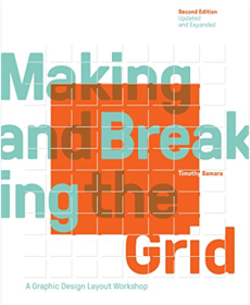 Basics include composing typographic space, format determination, and sequencing and systemization. Various types of grids manuscript, column, modular, hierarchical are also covered. Text reveals top designers' work in process and rationale. Projects with similar characteristics are linked through a simple notational system that encourages exploration and comparison of structure ideas. Each project is shown comprehensively so readers can see its structure revealed over several pages, at a size that allows for inspection of detail. Also included are historical overviews that summarize the development of layout concepts, both grid-based and non-grid based, in modern design practice. Form Design Patterns 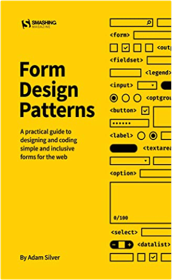 The Form Design Patterns book tackles this problem. By going through common real-world problems step by step, you’ll learn how to design simple, robust, lightweight, responsive, accessible, progressively enhanced, interoperable and intuitive forms that let users get stuff done no matter what. And by the end of the book you’ll have a close-to exhaustive list of components delivered as a design system that you can use immediately in your own projects. Table Of Contents A Registration Form — We’ll start looking at the foundational qualities of a well-designed form and how to think about them. By applying something called a question protocol, we’ll look at how to reduce friction without even touching the interface. Then we’ll look at some crucial patterns, including validation, that we’ll want to use for every form. A Checkout Form — We’ll consider checkout flows and look at several input types and how they affect the user experience on mobile and desktop browsers, all the while looking at ways to help both first-time and returning customers order quickly and simply. A Flight Booking Form — We’ll dive into the world of progressively enhanced, custom form components using ARIA. We’ll do this by exploring the best way to let users select destinations, pick dates, add passengers, and choose seats. We’ll analyze native form controls, and look at breaking away from convention when it becomes necessary. A Login Form — We’ll look at the ubiquitous login form. Despite its simple appearance, there’s a bunch of usability failures that so many sites suffer from. An Inbox — We’ll design ways to manage email in bulk, our first look at administrative interfaces. As such, this comes with its own set of challenges and patterns, including a responsive ARIA-described action menu, multiple selection, and same-page messaging. A Search Form — We’ll create a responsive search form that is readily available to users on all pages, and we’ll also consider the importance of the search mechanism that powers it. A Filter Form — Users often need to filter a large set of unwieldy search results. Without a well-designed filter, users are bound to give up. Filters pose a number of interesting and unique design problems that may force us to challenge best practice to give users a better experience. An Upload Form — Many services, like photo sharing, messaging, and many back-office applications, let users upload images and documents. We’ll study the file input and how we can use it to upload multiple files at once. Then we’ll look at the intricacies of a drag-and-drop, Ajax-enhanced interface that is inclusive of keyboard and screen reader users. An Expense Form — We’ll investigate the special problem of needing to create and add lots of expenses (or anything else) into a system. This is really an excuse to cover the add another pattern, which is often useful in administrative interfaces. A Really Long and Complicated Form — Some forms are very long and take hours to complete. We’ll look at some of the patterns we can use to make long forms easier to manage. Org Design For Design Orgs: Bulding & Managing In-House Design  Layout Essentials: 100 Design Principles for Using Grids 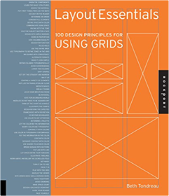 This book outlines and demonstrates basic layout/grid guidelines and rules through 100 entries including choosing a typeface, striving for rhythm and balance with type, combining typefaces, using special characters and kerning and legibility. These essentials of grid design are critical to the success of any job. The New Typography (Weimar and Now: German Cultural Criticism (Paperback))  Envisioning Information  Designing for Emotion  Practical Empathy: For Collaboration and Creativity in Your Work  |


Library at 3 Sided Coin
Collection Total:
156 Items
156 Items
Last Updated:
Nov 19, 2019
Nov 19, 2019
 Made with Delicious Library